A FloatingActionButton (FAB) is a circular button that floats above the UI and promotes a primary action in your application. It’s commonly used for actions like “Add”, “Create”, or “Compose”.
1. Add Material Dependency (Optional)
First, make sure to include the Material Components in your build.gradle (Module: app):
dependencies {
    implementation 'com.google.android.material:material:1.11.0'
}
2. Add FAB to XML Layout
Here is how to add a basic FloatingActionButton to your layout file (e.g. activity_main.xml):
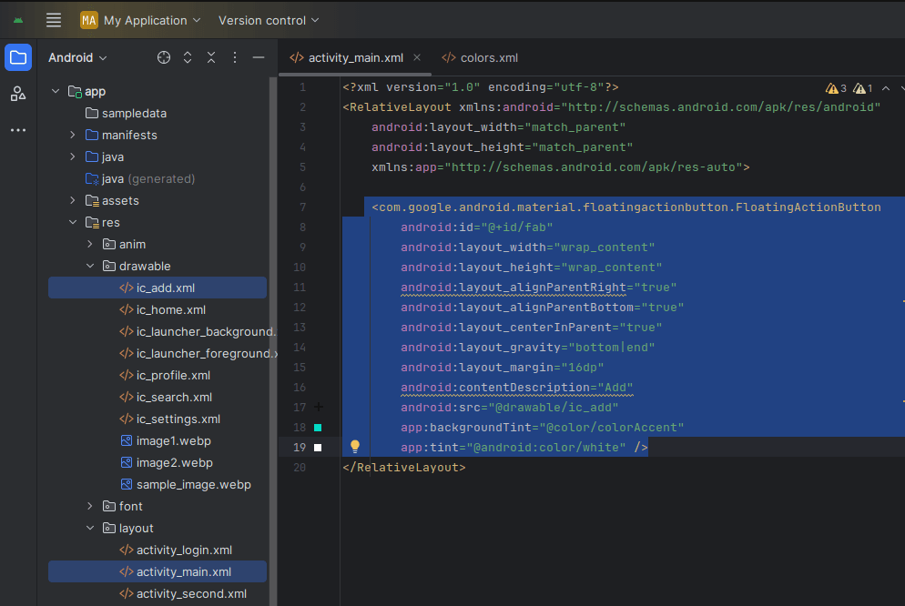
   <com.google.android.material.floatingactionbutton.FloatingActionButton
        android:id="@+id/fab"
        android:layout_width="wrap_content"
        android:layout_height="wrap_content"
        android:layout_alignParentRight="true"
        android:layout_alignParentBottom="true"
        android:layout_centerInParent="true"
        android:layout_gravity="bottom|end"
        android:layout_margin="16dp"
        android:contentDescription="Add"
        android:src="@drawable/ic_add"
        app:backgroundTint="@color/colorAccent"
        app:tint="@android:color/white"
/>
3. Handle Click in Java Code
In your MainActivity.java, you can reference and set a click listener:
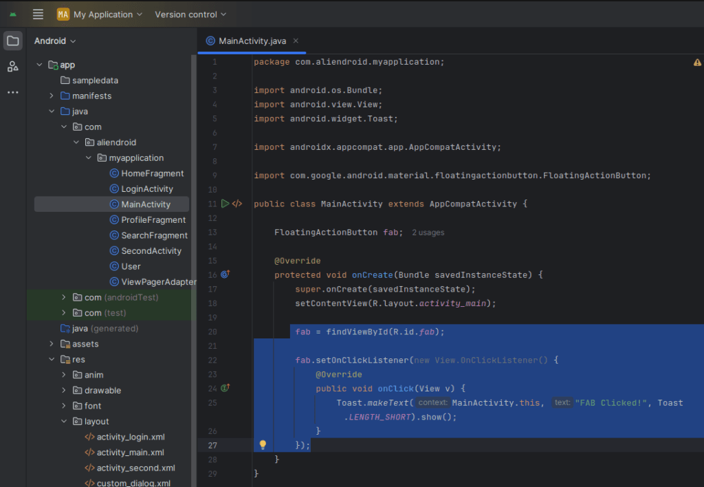
import android.os.Bundle;
import android.view.View;
import android.widget.Toast;
import androidx.appcompat.app.AppCompatActivity;
import com.google.android.material.floatingactionbutton.FloatingActionButton;
public class MainActivity extends AppCompatActivity {
FloatingActionButton fab;
@Override
protected void onCreate(Bundle savedInstanceState) {
super.onCreate(savedInstanceState);
setContentView(R.layout.activity_main);
fab = findViewById(R.id.fab);
fab.setOnClickListener(new View.OnClickListener() {
@Override
public void onClick(View v) {
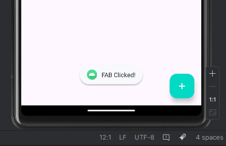
Toast.makeText(MainActivity.this, "FAB Clicked!", Toast.LENGTH_SHORT).show();
}
});
}
}4. Styling Tips
You can style the FAB using the following attributes:
app:backgroundTint: Changes the background color.app:tint: Changes the icon color.android:src: Set your FAB icon (PNG or Vector XML).- Use
StateListAnimatoror shadows for elevation effects.
Example for custom color and shadow:
app:backgroundTint="@color/purple_700"
android:elevation="10dp"
5. Use in CoordinatorLayout for Behavior
FAB supports automatic hiding on scroll when placed inside CoordinatorLayout. Example:
<androidx.coordinatorlayout.widget.CoordinatorLayout
    ... >

    <!-- Your content (e.g., RecyclerView, ScrollView) -->

    <com.google.android.material.floatingactionbutton.FloatingActionButton
        android:id="@+id/fab"
        app:layout_anchorGravity="bottom|end"
        app:layout_anchor="@id/your_anchor_view"
        android:layout_margin="16dp"
        ... />

</androidx.coordinatorlayout.widget.CoordinatorLayout>
6. Show/Hide FAB Programmatically
You can also show or hide FAB dynamically:
fab.hide(); // hides the FAB
fab.show(); // shows the FAB
Conclusion
FloatingActionButton is a powerful and visually appealing component in Android apps. Use it to highlight important actions and make your UI modern and intuitive. Styling it with custom colors and icons helps align it with your app’s theme.