Creating a responsive UI in Android means ensuring your app looks great and works smoothly across various screen sizes and resolutions. With Android running on thousands of devices—from phones and tablets to foldables—building flexible layouts is essential.
This guide will walk you through how to design responsive UIs in Java using Android Studio.
1. Use Density-Independent Pixels (dp)
Always use dp (density-independent pixels) instead of px to ensure consistent sizing across devices.
<TextView
    android:layout_width="200dp"
    android:layout_height="wrap_content"
    android:text="Responsive Text" />
2. Use ConstraintLayout for Flexible Positioning
ConstraintLayout is a powerful layout that helps you position views responsively.
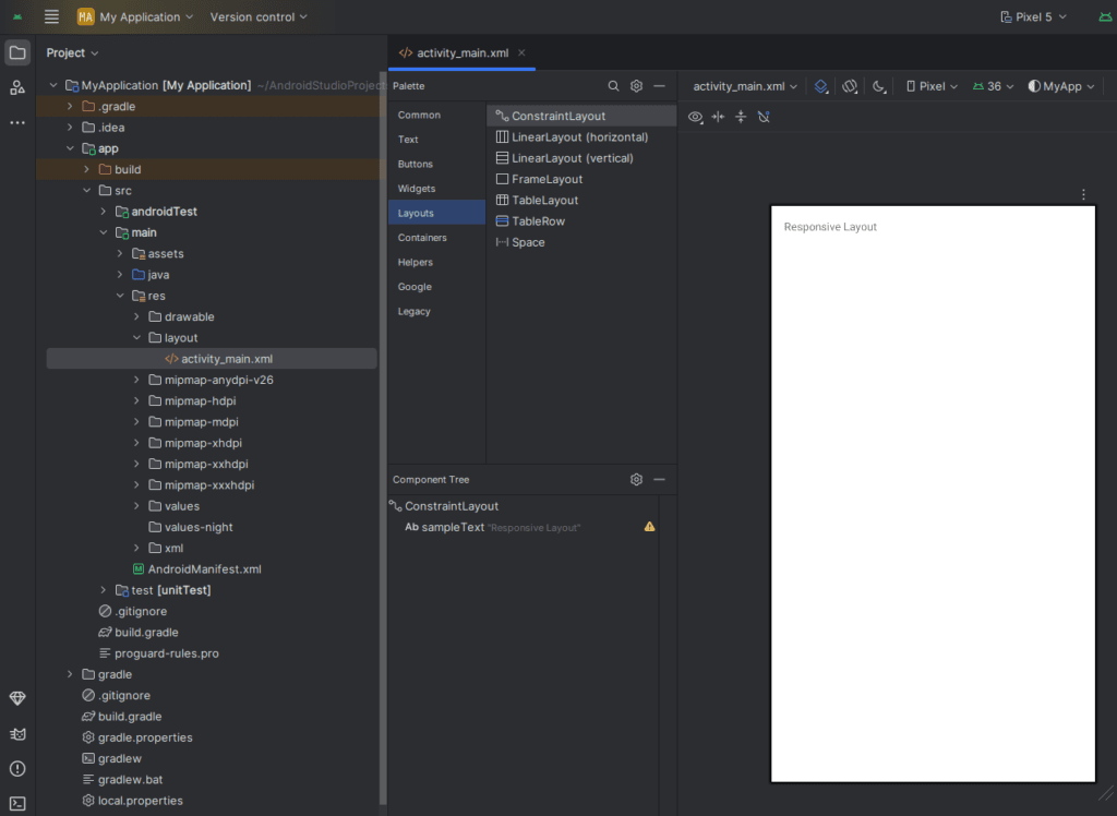
<androidx.constraintlayout.widget.ConstraintLayout
    xmlns:android="http://schemas.android.com/apk/res/android"
    xmlns:app="http://schemas.android.com/apk/res-auto"
    android:layout_width="match_parent"
    android:layout_height="match_parent">

    <TextView
        android:id="@+id/sampleText"
        android:layout_width="0dp"
        android:layout_height="wrap_content"
        android:text="Responsive Layout"
        app:layout_constraintStart_toStartOf="parent"
        app:layout_constraintEnd_toEndOf="parent"
        app:layout_constraintTop_toTopOf="parent"
        android:layout_margin="16dp"/>
</androidx.constraintlayout.widget.ConstraintLayout>
3. Create Layouts for Multiple Screen Sizes
Use resource qualifiers to provide different layouts for different screen sizes.
If it doesn’t exist, you can create it manually
- Right-click on the
layoutfolder >New>Directory
- Right-click on the
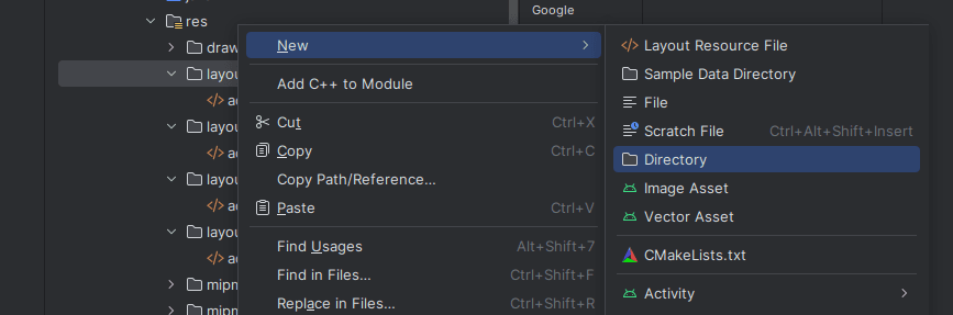
- Name the file:
layout-land.xml
- Name the file:
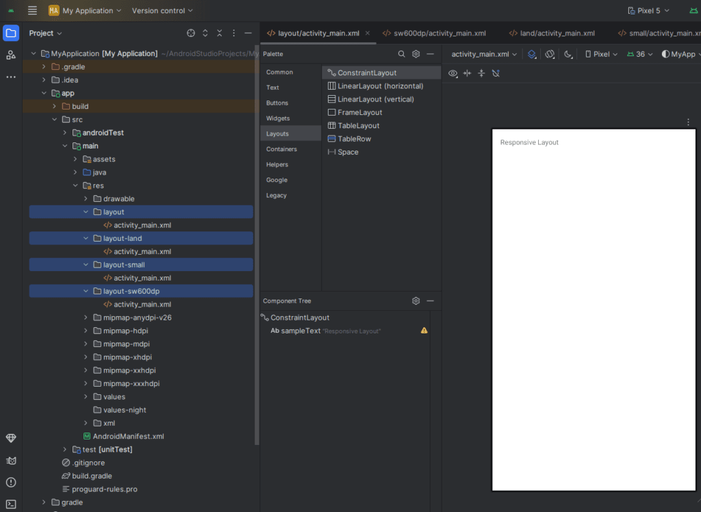
| Folder | Purpose |
|---|---|
res/layout/ | Default layout |
res/layout-sw600dp/ | For tablets (600dp and above) |
res/layout-land/ | Landscape orientation |
res/layout-small/, layout-large/ | For different screen sizes |
Example:
res/
├── layout/
│   └── activity_main.xml
├── layout-sw600dp/
│   └── activity_main.xml
4. Use values for Dimensions
Define dimension resources to manage spacing and sizing easily.
res/values/dimens.xml
<resources>
    <dimen name="padding_normal">16dp</dimen>
</resources>
res/values-sw600dp/dimens.xml
<resources>
    <dimen name="padding_normal">32dp</dimen>
</resources>
Use in layout:
android:padding="@dimen/padding_normal"
5. Use wrap_content and match_parent Intelligently
- Use
wrap_contentfor auto-sizing to content. - Use
match_parentfor full-width or height views.
- Use
6. Avoid Absolute Layouts and Fixed Sizes
Don’t hard-code widths or heights in pixels. Let the layout adapt using constraints and relative sizing.
7. Test Using Android Emulator and Preview
In Android Studio:
- Use Layout Editor Preview to check different screen sizes.
- Use Emulator with multiple device profiles (e.g. Pixel 4, Nexus 7, Foldables).
8. Use SmallestWidth Qualifiers
You can target screen widths using sw qualifiers like sw600dp, sw720dp etc., for tablets or foldables.
9. Consider Font Scaling (sp for Text)
Use sp (scale-independent pixels) for text sizes to respect user accessibility settings.
<TextView
    android:textSize="16sp" />
10. Bonus: Responsive Images
Put different image resolutions in folders like:
drawable-mdpidrawable-hdpidrawable-xhdpidrawable-xxhdpi
This ensures your app loads the best quality image for each screen density.
Final Tips:
- Use Android Studio’s Layout Validation tool.
- Avoid nesting too many layouts.
- Use Guidelines and Chains in ConstraintLayout for better responsiveness.
Conclusion
Creating responsive UIs in Android using Java is all about flexibility, scalability, and adaptability. With the right use of layouts, dimensions, and resource qualifiers, your app can provide a consistent and beautiful experience on any Android device.