Evolution of Web Design Trends Over the Years
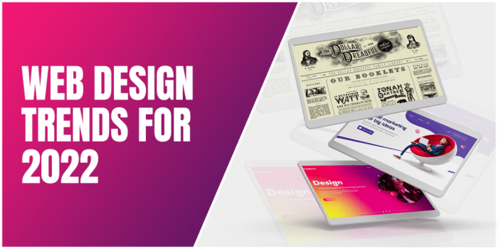
Evolution of web design trends over the years, from the early days of the internet to the modern web, showcases a fascinating journey of innovation and adaptation. Early websites were limited by technology, but as the internet evolved, so did design. The rise of Web 2.0 brought social media and user-generated content, making sites more interactive and user-friendly.
Responsive design became crucial with the proliferation of mobile devices. Modern web design now incorporates sophisticated technologies, pushing the boundaries of visual appeal and user experience.
This exploration delves into the key characteristics of web design throughout history, highlighting the technological advancements and design constraints that shaped each era. Examples of prominent websites from different periods will be used to illustrate the trends. We’ll also examine the impact of various factors, including mobile devices, social media, and JavaScript frameworks, on web design. Ultimately, this journey through time underscores the constant evolution of web design, from its humble beginnings to its current, dynamic state.
Early Web Design (1990s-2000s)
The dawn of the internet in the 1990s and early 2000s ushered in a new era of communication and information sharing. Web design during this period was profoundly influenced by the nascent technology and the evolving understanding of how to present information online. Early websites were often rudimentary, but they laid the groundwork for the sophisticated digital experiences we have today.The initial limitations of bandwidth, processing power, and display capabilities significantly impacted the design and functionality of websites.
This necessitated a focus on simplicity and efficiency in both the visual and interactive aspects of the web.
Key Characteristics of Early Web Design
Early web design was characterized by its stark simplicity. The primary focus was on presenting textual information, often with basic formatting like bolding, italics, and bullet points. Images were relatively rare and often low resolution, contributing to the text-heavy nature of these sites.
Technological Limitations and Design Constraints
Bandwidth limitations restricted the size and complexity of graphics and multimedia elements. Consequently, websites often relied heavily on text for conveying information. Slow loading times were common, making user experience a significant concern. The availability of browsers and their capabilities was another important factor in determining how sites were structured and displayed. Limited browser support for complex layouts and dynamic elements also influenced the design process.
Early websites were often built using HTML, CSS, and JavaScript, but their capabilities were limited compared to modern tools.
Prominent Websites and Design Elements
Early websites often featured a simple, clean layout with a focus on navigation. Navigation was typically achieved using text-based links, often in a hierarchical structure. Early examples of prominent websites included those of major corporations, news organizations, and educational institutions. These sites often showcased the company’s logo, contact information, and basic product or service descriptions. The design elements often reflected the brand identity of the organization.
For instance, a corporate site might feature its company logo prominently and employ colors and fonts associated with its brand image.
Aesthetics and Visual Styles
The aesthetics of early websites were often quite basic. Color palettes were typically limited, often employing a muted color scheme. Font choices were straightforward and usually limited to the fonts supported by the prevalent browsers. Images, when present, were often small and low resolution, adding to the overall simplicity of the design. The focus was on clear and easily readable content.
Functionality and Interactivity
The functionality of early websites was significantly limited compared to today’s standards. Interactivity was minimal, with basic forms for user input and simple animations. Dynamic content was virtually non-existent. A key aspect of functionality was ensuring compatibility across different browsers and operating systems. The experience was primarily focused on reading and viewing information.
The emphasis was on presenting information in a straightforward manner.
Evolution of Web Browsers and Their Impact
| Browser Name | Release Year | Key Features | Impact on Design |
|---|---|---|---|
| Mosaic | 1993 | Early graphical browser, supporting images and multimedia | Enabled more visually appealing websites with limited graphics |
| Netscape Navigator | 1994 | Dominant browser, supporting more complex layouts and JavaScript | Allowed for more dynamic and interactive elements on websites |
| Internet Explorer | 1995 | Widely adopted browser, initially focused on compatibility | Influenced design trends toward what worked across different platforms and browsers. |
| Mozilla Firefox | 2002 | Open-source browser, promoting flexibility and customization | Offered a different design approach and more freedom for web developers |
Rise of Web 2.0 (2000s-2010s): Evolution Of Web Design Trends Over The Years
Source: logopoppin.com
The shift from the static, informational websites of the 1990s and early 2000s to the dynamic, interactive spaces of Web 2.0 was significant. This evolution was driven by a confluence of factors, including the increasing availability of broadband internet, the rise of social media, and a growing desire for user-centric design. This period saw a dramatic change in how users interacted with the web, moving from passive consumers of information to active participants in online communities.The emergence of Web 2.0 fundamentally altered the way websites were designed and developed.
It prioritized user experience, collaboration, and ease of use, leading to a more engaging and user-friendly internet. This shift also influenced the way businesses interacted with customers and fostered new forms of online communities.
Major Web Design Trends
The Web 2.0 era brought about several key design trends that distinguished it from previous periods. These trends emphasized user interaction, accessibility, and community building. A strong focus was placed on intuitive navigation, making it easier for users to find information and participate in online activities.
Impact of Social Media and User-Generated Content
Social media platforms, such as Facebook, Twitter, and YouTube, became integral parts of daily life. Their impact on website design was profound. Sites began to incorporate social sharing buttons, commenting features, and real-time updates. The rise of user-generated content (UGC) further transformed web design, requiring websites to accommodate diverse user contributions and feedback. Websites had to adapt to accommodate these features.
Examples of Popular Websites
Several popular websites from this period exemplified these trends. Sites like Flickr and YouTube demonstrated how user-generated content could be effectively showcased and organized. The design of these platforms fostered community interaction and user engagement. Platforms like MySpace and Friendster showcased early social networking features, highlighting the importance of community and interaction. Blogs and forums also became more prominent, demonstrating how user-generated content and interaction could shape the online experience.
Interactive and User-Friendly Design
Web design in the late 2000s became significantly more interactive and user-friendly compared to the early 2000s. This shift was marked by the adoption of more intuitive navigation systems, simplified interfaces, and a greater emphasis on visual appeal. The design of websites became more visually appealing, with a focus on clean layouts and consistent branding. The integration of JavaScript and other interactive technologies allowed websites to respond dynamically to user actions.
Comparison of Design Elements
Early 2000s websites often featured bulky navigation bars, Flash animations, and a more static presentation style. In contrast, late 2000s designs prioritized cleaner, simpler layouts, CSS-based styling, and interactive elements. A noticeable trend was the move away from overly complicated Flash animations to more sophisticated and functional CSS-based designs.
Summary of Social Media Platforms and Their Influence
| Platform Name | Key Features | User Interaction | Design Impact |
|---|---|---|---|
| Social networking, news feed, messaging | Connecting with friends, sharing updates, engaging in discussions | Prompted the integration of social sharing buttons, news feeds, and commenting sections into websites | |
| Microblogging, real-time updates, hashtags | Sharing short messages, following influencers, participating in conversations | Influenced the design of real-time update systems and the use of hashtags for categorized content | |
| YouTube | Video sharing, community forum, comments | Sharing videos, interacting with comments, engaging with creators | Encouraged the incorporation of video embeds and commenting sections into website designs |
| Flickr | Photo sharing, tagging, groups | Sharing photos, organizing photos by tags, participating in groups | Highlighted the importance of showcasing user-generated content and effective organization systems |
Responsive Web Design (2010s-Present)
The advent of smartphones and tablets dramatically altered the way people accessed the web. This shift necessitated a new approach to web design that could adapt seamlessly to various screen sizes and orientations. Responsive web design emerged as the solution, enabling websites to provide an optimal viewing experience across a wide range of devices.The focus on mobile-first design became paramount.
Developers prioritized the mobile experience, ensuring a clean, intuitive interface and fast loading times. This approach, while seemingly simple, had a profound impact on the overall development process and the user experience.
Shift Towards Mobile-First Design
The rise of mobile devices fundamentally changed the way users interact with websites. Mobile-first design recognizes that the majority of users will access websites via mobile devices. This approach ensures that the core functionality and user experience are optimized for the smallest screens first, then scaled up for larger devices. This prioritization often results in cleaner, more intuitive interfaces tailored to touch-screen interactions and limited screen real estate.
Key Features of Responsive Web Design
Responsive web design hinges on several key features. These features facilitate adaptability across diverse screen sizes and resolutions.
- Fluid Grids: These grids dynamically adjust to different screen widths, maintaining proper spacing and alignment across various devices. This ensures a consistent user experience, regardless of the screen size.
- Flexible Images: Images automatically resize to fit the available screen space, preventing distorted displays or wasted space. Optimized image formats are crucial to maintain performance.
- Media Queries: These CSS rules target different screen sizes and device types. They dictate how the layout and elements should adjust to accommodate various screen dimensions. This precise control allows designers to tailor the experience for each device type.
- Viewport Meta Tag: This meta tag instructs the browser on how to manage the viewport, which is the area of the screen used to display the webpage. This tag controls the initial zoom level and scaling, preventing unexpected behavior.
Importance of UX and UI
User experience (UX) and user interface (UI) are critical components of responsive web design. A well-designed UI ensures easy navigation and interaction, while a strong UX optimizes the overall user journey. The combination of a polished UI and an intuitive UX leads to higher user satisfaction and engagement. Prioritizing user needs and preferences throughout the design process is key to success.
Role of Mobile Devices in Shaping Trends
Mobile devices have profoundly influenced web design trends. The touch-screen interface, limited screen real estate, and varying screen sizes demand a different approach to design compared to desktop websites. Mobile-first design, with its focus on simplicity and intuitive interactions, has become the standard.
Adoption of CSS Frameworks and Pre-built Components
The use of CSS frameworks and pre-built components has accelerated the development process. Frameworks like Bootstrap and Foundation provide pre-designed layouts, components, and utilities, enabling developers to quickly build responsive websites without starting from scratch. These frameworks streamline the process, reduce development time, and promote consistency across projects.
Evolution of Mobile Devices and Their Influence on Website Responsiveness
The table below highlights the evolution of mobile devices and their impact on website responsiveness.
| Device Type | Key Features | Screen Size | Design Considerations |
|---|---|---|---|
| Early Smartphones (2000s) | Limited screen resolution, touchscreens | Small, constrained display | Focus on minimal design, intuitive touch controls, and essential content |
| Modern Smartphones (2010s-present) | High resolution, large touchscreens, diverse form factors | Varying sizes, aspect ratios | Complex layouts, rich media, large images, and a need for optimal scaling and performance |
| Tablets (2010s-present) | Larger screens, more akin to desktop-like browsing | Medium to large screen sizes | Balance between mobile-first simplicity and desktop functionality, consideration for various aspect ratios |
| Foldable Devices (Present) | Flexible screens, unique form factors | Variable screen size, potentially very large | Adaptive design that adjusts to the open and closed states of the device, support for multiple orientations |
The Modern Web (2010s-Present)
The modern web, emerging from the foundations of responsive design, has undergone a dramatic transformation, driven by advancements in web technologies and a shift in user expectations. This period has witnessed a significant increase in user engagement and experience, largely due to the rise of interactive elements and dynamic content delivery. Developers have embraced powerful tools to enhance user interfaces and create more engaging digital experiences.The modern web is characterized by sophisticated user interfaces, driven by the integration of powerful web technologies, leading to more engaging and dynamic user experiences.
JavaScript frameworks, micro-interactions, and animations have played a crucial role in reshaping the way websites are designed and perceived. Accessibility has become a paramount consideration, ensuring that websites are usable by a broader range of users. Typography, too, has evolved to play a more integral role in shaping the visual hierarchy and aesthetic appeal of websites.
Impact of JavaScript Frameworks
JavaScript frameworks like React, Angular, and Vue have revolutionized web development. These frameworks provide structured approaches to building complex user interfaces, enabling developers to create dynamic and interactive web applications with improved performance and scalability. This enhanced capability allows for more sophisticated design elements, making websites responsive and engaging.
Rise of Micro-interactions and Animations, Evolution of web design trends over the years
Micro-interactions and animations have become integral components of modern web design. These subtle yet impactful interactions, such as tooltips, progress bars, and animations, improve the user experience by providing visual feedback and guiding users through the website. The use of animations can create a more engaging and aesthetically pleasing experience, highlighting key elements and drawing attention to important areas.
Examples of Websites Using Modern Design Elements
Numerous websites effectively leverage these modern design elements. For example, Netflix utilizes micro-interactions and animations to guide users through their content discovery process. Their smooth transitions and intuitive feedback mechanisms enhance the overall user experience. Airbnb’s website employs dynamic content and interactive maps, providing a visually engaging and immersive experience for users searching for accommodations. These are just two examples; many more sites demonstrate the effectiveness of incorporating these elements.
Significance of Accessibility in Web Design
Accessibility is paramount in modern web design. Websites must be usable by individuals with diverse abilities, including those with visual, auditory, motor, or cognitive impairments. This involves adhering to accessibility guidelines, such as WCAG (Web Content Accessibility Guidelines), to ensure inclusivity and usability for all users. By prioritizing accessibility, designers create websites that are beneficial to a broader audience.
Evolution of Typography and Visual Appeal
Typography plays a critical role in creating a visually appealing and accessible website. Modern web design emphasizes the use of appropriate fonts, sizes, and spacing to enhance readability and create a cohesive visual identity. Careful consideration of typography helps establish a brand’s visual aesthetic and aids in communicating information effectively to users. A well-designed typography scheme improves the overall aesthetic and usability of a website.
JavaScript Frameworks and Design Applications
| Framework Name | Key Features | Design Applications | Popularity |
|---|---|---|---|
| React | Component-based architecture, virtual DOM, JSX | Complex user interfaces, dynamic content, single-page applications | High |
| Angular | TypeScript support, structured development, dependency injection | Large-scale applications, enterprise-level projects, data-driven interfaces | Medium |
| Vue | Easy to learn, progressive adoption, flexible | Interactive components, responsive designs, both small and large projects | High |
Visual Trends and Aesthetics

Source: wordpress.com
The evolution of web design aesthetics reflects broader cultural and technological shifts. From the early days of simple layouts to the sophisticated visual experiences of today, the visual elements of websites have become increasingly crucial in attracting and engaging users. Understanding these trends allows designers to create websites that not only function well but also resonate with their target audience.
Color Palettes and Brand Identity
Color palettes play a significant role in establishing a brand identity and evoking specific emotions. A thoughtfully chosen color scheme can create a cohesive and memorable brand experience, communicating the brand’s personality and values. The use of color theory principles, such as complementary, analogous, and triadic color schemes, helps designers create visually appealing and effective color palettes.
Typography in Web Design
Typography is another critical visual element in web design. Font choices directly influence the overall aesthetic and readability of a website. The selection of fonts should align with the brand identity and enhance the user experience. Considerations include font size, weight, style, and spacing, all of which impact the overall readability and visual appeal of the content.
Visual Hierarchy and User Engagement
Visual hierarchy is the arrangement of visual elements to guide the user’s eye through the content. This is achieved through various techniques, such as size, color, contrast, and spacing. A well-defined visual hierarchy ensures that users can easily locate important information and navigate the website efficiently, ultimately improving user engagement.
Imagery and Graphics in Web Design
Imagery and graphics play a vital role in enhancing website content and conveying information effectively. High-quality images and graphics can create a more engaging and memorable experience for users, while also helping to illustrate concepts and make content more accessible. The use of appropriate imagery and graphics can significantly improve website usability and visual appeal.
Examples of Compelling Visual Aesthetics
Several websites demonstrate compelling visual aesthetics, showcasing the impact of well-designed color palettes, typography, and imagery. For instance, the minimalist design of Apple’s website effectively communicates the brand’s sophisticated image, while the use of bold colors and striking graphics in websites like Adobe’s website creates a sense of energy and creativity.
| Era | Dominant Colors | Palette Examples | Impact on Design |
|---|---|---|---|
| Early Web (1990s-2000s) | Muted tones, primarily blues, greens, and browns. | Websites often used a limited color palette to ensure compatibility across different browsers and platforms. | Limited color choices constrained design, but emphasized functionality over aesthetics. |
| Rise of Web 2.0 (2000s-2010s) | Vibrant, contrasting colors, and gradients. | Social media platforms like Facebook and Twitter popularized the use of bright, attention-grabbing color palettes. | Color became a key tool for differentiation and creating engaging user interfaces. |
| Responsive Web Design (2010s-Present) | Neutral palettes with subtle variations, often with a focus on accessibility. | Many websites utilize a range of subtle tones for a cleaner and more modern aesthetic. | Emphasis on usability and accessibility led to more nuanced color choices. |
| The Modern Web (2010s-Present) | Bold, dynamic palettes, incorporating trendy color combinations and gradients. | Many websites employ a spectrum of colors and vibrant contrasts to create dynamic visual experiences. | Modern designs leverage color to create impactful and memorable visual experiences. |
Emerging Technologies and Trends
The ever-evolving digital landscape is pushing the boundaries of web design. Emerging technologies are transforming the user experience, demanding a shift in how designers approach creation and delivery. This section explores the significant impact of artificial intelligence, virtual/augmented reality, personalization, interactive elements, multimedia, and sustainability on the future of web design.The incorporation of these technologies promises to revolutionize the way users interact with websites, making them more intuitive, engaging, and tailored to individual needs.
A key focus is creating immersive experiences that transcend the traditional limitations of the screen, fostering stronger connections between users and brands.
Artificial Intelligence and Machine Learning
AI and machine learning are revolutionizing website functionality. Sophisticated algorithms enable dynamic content personalization, predictive analysis, and automated tasks. For example, AI-powered chatbots can provide instant customer support, tailoring responses to individual needs, leading to enhanced user engagement and efficiency. Further, AI can analyze user behavior to identify trends and preferences, enabling websites to proactively adapt and offer relevant content.
Virtual and Augmented Reality
VR and AR are transforming the web design paradigm, moving beyond the traditional 2D experience. Immersive VR environments can create virtual showrooms or product demonstrations, providing users with a tangible sense of presence. AR overlays digital information onto the real world, enriching user engagement with interactive experiences, like interactive product catalogs or virtual try-on tools.
Personalization and Customization
Personalization is a key driver in modern web design. Websites can tailor content, recommendations, and user interfaces based on individual preferences and past behavior. This personalized approach creates a more engaging and relevant experience for each user. For example, e-commerce platforms use personalization to suggest products based on browsing history, leading to increased sales and customer satisfaction.
Interactive Elements and Multimedia
Interactive elements are becoming increasingly crucial for user engagement. Interactive maps, quizzes, and simulations can transform passive browsing into an active learning experience. The integration of high-quality video and audio content enhances the richness and emotional impact of web experiences.
Tools and Techniques for Enhanced User Experience
Modern web design tools facilitate user-centric development. Frameworks like React and Vue.js provide efficient methods for building complex user interfaces. Designers are leveraging these tools to craft responsive, adaptable, and highly interactive web applications. For instance, using responsive design techniques, a single website can adapt to different screen sizes, ensuring a consistent experience across various devices.
Sustainability and Ethical Considerations
Environmental and ethical concerns are paramount in web design. Sustainable practices, such as reducing server load and minimizing bandwidth consumption, are crucial. Designers are also incorporating ethical considerations, ensuring accessibility and privacy compliance.
Example: An Interactive Web Application – “Eco-Explorer”
“Eco-Explorer” is an interactive web application designed to educate users about environmental issues and encourage sustainable practices.
- Interactive Map: Users explore a dynamic map of their region, identifying local environmental challenges and potential solutions. Information about pollution levels, conservation efforts, and local initiatives is presented in an intuitive manner, providing a personalized experience.
- Multimedia Content: Videos, infographics, and interactive 3D models visualize environmental data and highlight the impact of human activities.
- Personalized Recommendations: Based on user input and location, the application suggests sustainable actions, such as local recycling programs, community gardens, and energy-saving tips.
- Gamified Learning: Users can participate in challenges and quizzes, earning points and unlocking new content as they learn about environmental issues.
- Accessibility and Inclusivity: The application prioritizes accessibility features, ensuring that users with disabilities can fully engage with the content.
Final Wrap-Up
In conclusion, the evolution of web design trends over the years is a testament to the ever-changing digital landscape. From the limitations of early web design to the sophisticated interactive experiences of today, the journey reflects the constant pursuit of innovation and user-centric design. The future of web design promises even more exciting developments, fueled by emerging technologies and the ongoing need to create seamless and engaging online experiences.


Post Comment